
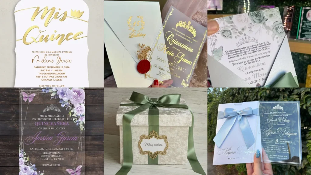

Looking for quinceanera invitations with pretty bows, butterflies or a little gold shine? There’s plenty to choose from here, from simple floral cards to pink mirror-shaped designs.
I especially love the little crowns and oversized lettering.
You can keep things simple or go all out. A few images show wedding stationery or a decorative box rather than quince invitations, so those are included as design inspiration with the differences noted.
Invitation designs and details worth saving
gold script and curved edges

We’re starting off strong with this gorgeous white and gold invitation. I love the oversized “Mis Quince” lettering and the little crown beside it. The curved edges make even this simple color combination feel special.
Keep your event details smaller underneath if you want to follow the same layout.
red rose and matching scroll

How pretty is this red and gold pairing? The cream-colored invitation has a deep red rose down one side, with decorative curls around the lettering.
There’s also a rolled scroll and a gold-colored box with a red bow. Save this one if you like the idea of a coordinated presentation rather than a card on its own.
pink mirrors and butterflies

I am obsessed with these mirror-shaped invitations. The ornate pink handles are so cute, plus those big butterflies sit right over the matching bows.
Each one rests in a rectangular box with a floral design underneath. If you want to go all out with pink, there’s plenty of inspiration here.
sparkling pink butterfly wrap
This butterfly invitation may just be one of my favorites here. I love the pink sparkling cutouts around the sides and the oversized bow across the middle.
The insert has flowers, a crown and a figure in a pink gown. Try repeating one of those details in your other party stationery.
gold lettering and a red seal
If you love gold lettering but still want a little color, this one is for you. The see-through invitation has an ornate crown, curling borders and a tiny butterfly near the bottom.
My favorite part is the red crown seal on the white envelope. The little flower sprig tucked behind it is such a pretty extra.
royal blue and silver curls

The royal-blue bow and silver-colored scrollwork look so pretty together. I especially love the round sparkling detail at the center of the bow.
This appears to be anniversary stationery rather than a quince invitation, so keep it as color and border inspiration. For your version, use birthday wording on the dark blue insert.
pink petals and green leaves

Don’t want to add a big bow or sparkling border? No problem!
This floral card has pink blooms, scattered petals and muted green leaves around a pale background.
The black lettering keeps the middle simple. I’d keep that open space around your name rather than adding more flowers.
brown envelope and gold crown

This is a similar gold-lettered design to the one above, but the envelope gives it a different look. I love the plain brown background beside the ornate crown and butterfly details.
The small flower sprig and round gold-colored seal are worth saving if you want decoration without a large bow.
sage bow and pale roses

How cute is this sage-green bow? The pale roses on the insert bring that same green into the invitation itself, with a small crown sitting above the wording.
The angled sides of the pale pocket leave the floral top showing. Don’t forget a little sparkling center if you want to follow this bow design.
white pocket and gold cord

If you’re looking for a way to skip the oversized ribbon, go with a narrow gold-colored cord like this one. It wraps around the white pocket beneath a small cluster of pale flowers and a round seal.
The invitation above it has a double-line border, a crown and outlined roses in one corner.
red bow and horseshoe detail

That little horseshoe is such a fun alternative to a sparkling bow center. The bright red border and bow sit beside gold-colored cutout panels.
The visible heading identifies this as a wedding invitation, not a quince invitation. You could borrow the red-and-gold combination and horseshoe detail for a Western-inspired birthday design with new wording.
purple flowers and butterflies

I love this purple floral design. The flowers fill opposite corners while two butterflies sit near the other corners, so there’s still plenty of room for the lettering.
Try a purple script name with smaller white event details to follow this clear-background look. The tiny crown is a lovely finishing touch.
lilac bow and dangling sparkle
If you are looking for lots of little details, then this one is for you. There’s silver-colored scrollwork, a lilac bow and even a purple teardrop-shaped ornament hanging from the center.
I love the darker purple accent against the pale pink insert. Keep that combination if you want something a little different from all-over pink.
gold cutouts and blush bows

These gold-colored floral cutouts are just too pretty. The pale pink bow sits across the lower half, leaving the curved opening at the top visible.
There’s already so much detail in the wrap that I’d leave the bow plain, just like this. It doesn’t need another ornament in the middle.
pink flourishes and a crown

Love a curved invitation edge? This one follows it with pale pink flourishes and an ornate gold-colored crest at the top.
The wording is for a wedding, so this is a shape and decoration reference rather than a ready-to-use quince design. Ask for your own initial beneath the crown and birthday wording through the center.
green bow and framed label
This image shows a decorative lidded box rather than an invitation. I love the long green ribbon tails and the little gold-colored frame on the front.
If you’re putting together a matching stationery set, you could borrow those details for an invitation pocket or presentation box. No invitation is visible inside this one.
burgundy roses and gold flowers
I am obsessed with this burgundy and gold combination. The dark red roses across the top match the big bow, with sparkling floral cutouts folding over the insert.
There’s also a gown illustration peeking out at the bottom. Keep the bow across the middle if you want that lower detail to stay visible.
ornate gold and an ivory bow

There’s so much to love about this ornate border, from the round floral shapes to the tiny loops along the edges. The ivory-colored bow has narrow gold-colored stripes and a sparkling center.
Read also: 20 Olive Green Wedding Invitations and Matching Stationery Ideas
This is another wedding invitation, so the wording would need to change. Borrow the border and bow pairing if you want a more elaborate quince design.
black wrap and yellow sunflowers

Want something other than pink flowers and crowns? This black-and-yellow combination is so cute.
A sunflower decoration sits over the black bow, with more sunflowers printed on the insert.
I especially love how the angled opening reveals the flowers at the top and bottom. You could keep the rest of your stationery black with small yellow accents.
pale blue bow and clear card
Last but definitely not least, we have this pretty pale blue invitation set. I love the long bow tails on the pocket!
The clear card beside it has white lettering, a little crown and a simple double border.
Keep your name large on both pieces if you want to follow this coordinated look.
Just a little note - some of the links on here may be affiliate links, which means I might earn a small commission if you decide to shop through them (at no extra cost to you!). I only post content which I'm truly enthusiastic about and would suggest to others.
And as you know, I seriously love seeing your takes on the looks and ideas on here - that means the world to me! If you recreate something, please share it here in the comments or feel free to send me a pic. I'm always excited to meet y'all! ✨🤍
Xoxo Alessandra