
Skip the intro · jump to the list ↓
This list is for anyone staring at a blank template wondering what actually goes on a details card, lol! Maybe you’re planning your own wedding, maybe you’re a bridesmaid helping out, or maybe you just love pretty paper. Either way, you’re in the right spot.
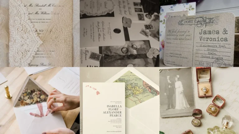
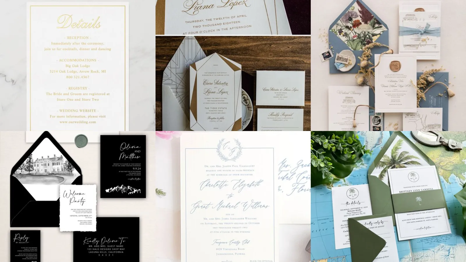
A details card is that little extra piece in the invitation suite that holds the info everyone actually needs. Hotel blocks, registry links, wedding website, dress code, all the things that doesn’t fit on the main invite.
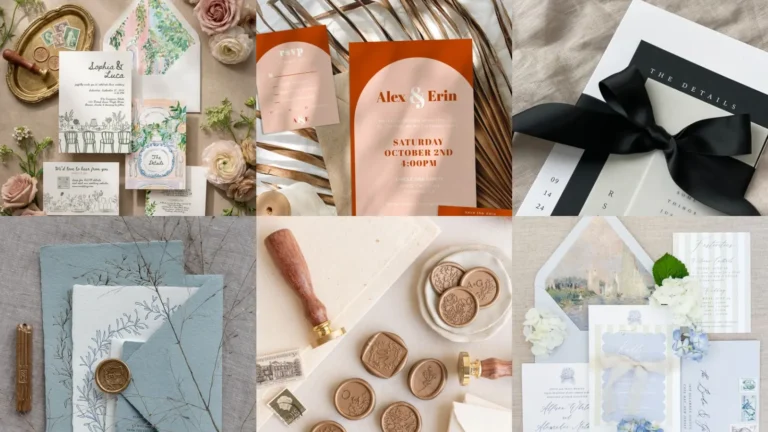
These 20 were pulled from hundreds of designs. Only the ones that looked doable at home or affordable through a print shop stuck around. No overly complicated layouts that need a graphic design degree to pull off!
They’re organized by style, so scroll until something matches your color palette or theme. Gold foil, watercolor, boho, black and white, there’s a little of everything in here.
Under each one you’ll find the small details worth knowing, like what makes it unique or what to watch for before you order a hundred copies. Ready to find your favorite?
Let’s get into it.
INVITATION SUITE DETAILS CARDS
Elegant Gold Foil Details Card
Gold foil catches the light in a way that photographs really well, which matters more than people expect. This one uses a thin foil border with foil text for the essentials only.
Skip foil if your budget is tight this month; it does add cost per card. Worth it for a formal black tie affair though.
Minimalist Script Details Card
Minimalist script reads as a whisper instead of a shout. Honestly that’s the whole appeal. Just a name, a date, a website, set in a flowing font with tons of white space.
This layout is the easiest one on this list to DIY at home with a printer and cardstock. No fancy equipment required.
Watercolor Floral Details Card
Watercolor florals bring softness that suits a garden or spring wedding better than almost anything else here. The blooms bleed slightly at the edges, which is the whole charm of the technique.
Are you seeing the color blending on this one? It looks hand painted even when it’s printed.
Vintage Botanical Details Card
Vintage botanical designs pull from old field guide illustrations, all those detailed line drawings of leaves and stems. It reads formal without being stiff, which is a tricky balance to hit.
This style pairs beautifully with a wax seal or a deep green envelope. Consider it your library wedding aesthetic.
Modern Geometric Details Card
Sharp lines and bold shapes define this modern geometric option, no soft edges anywhere. Triangles, arches or hexagons frame the text block depending on the version you pick.
It suits a city loft wedding or a couple who wants something that doesn’t scream traditional. Not everyone’s style, but the ones who love it really love it.
Rustic Kraft Paper Details Card
Kraft paper gives that warm, brown paper package look that pairs so well with a barn or vineyard venue. Cream ink or white ink on top makes the text pop without losing the rustic feel.
Budget friendly too, which never hurts.
Navy And Gold Details Card
Navy and gold is a combination that never really goes out of style, is it? The deep blue background with metallic text feels formal and a little bit glamorous.
This pairs naturally with a winter or evening wedding. It also photographs beautifully against white tablecloths.
Blush Pink Details Card Design
Soft, blush pink details card designs lean romantic without tipping into overly sweet territory. A thin gold or rose gold accent line usually finishes the entire look.
This one works well for a spring or summer wedding with a soft, romantic color story. It’s a safe pick if you’re worried about picking something too bold.
Wax Seal Details Card Accent
A wax seal accent turns a plain card into something that feels a little ceremonial. It doesn’t need to be fancy either; a simple monogram stamp in a matching color does the job.
Fair warning, wax seals can crack in transit if you’re mailing them. A seal sticker is the workaround plenty of couples use instead.
Calligraphy Details Card Layout
Calligraphy layouts put the handwriting front and center, so all of the design revolves around the lettering itself. Real calligraphy costs more, but a calligraphy style font gets close for a fraction of the price.
This is the one to copy first if you want elegance without hiring an actual calligrapher. Not that I’m judging anyone who splurges on the real thing, haha!
Boho Terracotta Details Card
Terracotta and boho go together the way peanut butter and jelly do, honestly. Think dried florals, earthy tones and a slightly imperfect, hand-drawn border.
This style suits an outdoor or desert wedding especially well. It’s also forgiving if your printer runs a shade warm or cool.
Black And White Details Card
Black and white never needs an excuse to show up on this list. Crisp text against a stark background feels timeless in a way color trends just don’t.
This is the safest pick if you’re torn between five other styles. When in doubt, go monochrome!
Tropical Greenery Details Card
Tropical greenery details cards are basically a permission slip to go big on the palm leaves. Monstera prints and palm fronds border the text like a mini jungle.
This one is perfect for a destination beach wedding or anyone who just loves a tropical theme at home. Are you loving those green tones as much as I am?
Art Deco Inspired Details Card
Art Deco brings the fan shapes, the sharp gold lines, the full Gatsby feeling straight to the details card. It’s a bold choice, but it commits fully to a theme.
This suits a couple hosting a glam city wedding or a New Year’s Eve celebration. Not a subtle option. Honestly that’s the fun of it.
Sage Green Details Card Style
Sage green has quietly taken over wedding color palettes the last few years. This style shows exactly why. The muted tone feels calm instead of trendy, which gives it staying power.
It pairs well with cream, gold or dusty rose accents.
Monogram Crest Details Card
A monogram crest adds instant formality, the kind you’d see on an old family seal. Two initials interlock or sit inside a small emblem at the top of the card.
This works especially well for couples combining last names or hosting a formal ballroom reception.
Pressed Flower Details Card
Real pressed flowers get scanned and printed right onto the card, so every petal and vein shows through. No two designs ever look completely identical, which is half the appeal.
This one takes a bit more lead time since the flowers need pressing and drying first. Worth planning for months ahead if this catches your eye.
Marble Texture Details Card
Marble texture backgrounds give an upscale, almost stone-like finish without any actual marble involved. Veins of gold or gray swirl behind clean, simple text.
This suits a modern, elegant wedding at a hotel or gallery space. It photographs incredibly well under warm lighting too.
Bold Typography Details Card
Bold typography flips the usual script by making the words the main event instead of a border or illustration. Big, confident letters spell out the essentials in a single glance.
This is a great pick for a couple who wants something modern and a little unexpected. It skips the florals entirely. Honestly that feels refreshing.
Destination Wedding Details Card
Last but definitely not least, we have the destination wedding details card. Maps, plane icons and travel information take center stage since guests need the extra logistics.
This style usually includes flight tips, luggage notes or a small itinerary for the weekend. It earned a spot on this list because destination weddings need more communication, not less.
Pack it with every detail your guests could possibly need. They’ll thank you for it once they land!
Just a little note - some of the links on here may be affiliate links, which means I might earn a small commission if you decide to shop through them (at no extra cost to you!). I only post content which I'm truly enthusiastic about and would suggest to others.
And as you know, I seriously love seeing your takes on the looks and ideas on here - that means the world to me! If you recreate something, please share it here in the comments or feel free to send me a pic. I'm always excited to meet y'all! ✨🤍
Xoxo Alessandra
✨ Wait! Your next favorite is right here
These are the posts readers open next. See why: