
Skip the intro · jump to the list ↓
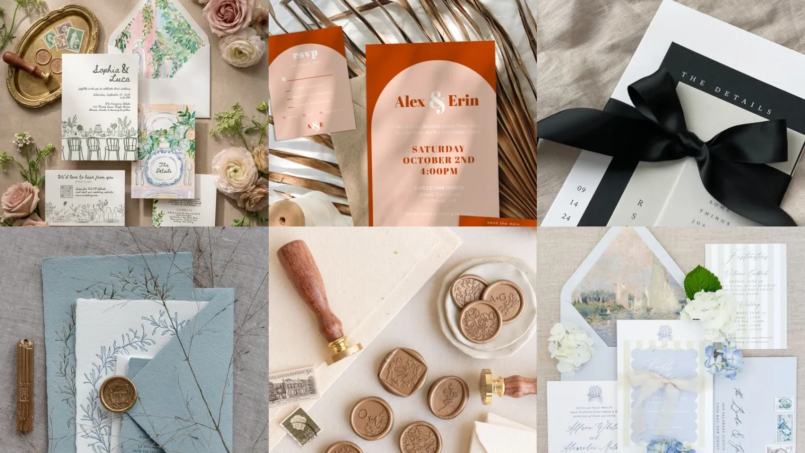
By the end of this list you’ll have twenty entire invitation suites to save, screenshot or send straight to your stationer. That’s the promise, plain and simple.
Choosing these wasn’t exactly scientific, lol! I scrolled through hundreds of pins looking for suites that actually look this good in real life, not just in a styled flat lay.
So anything with too many tiny fussy pieces got skipped. The ones left standing are the suites a home printer or a small Etsy shop could realistically pull off.
You’ll notice a real mix here. Some ideas lean fancy, some lean casual. There’s a whole stretch in the middle for anyone still deciding on a wedding color palette.
Each idea below has a little detail pulled straight from the design itself, so you know exactly what makes it worth copying. Ready to find your favorite?
Grab a coffee and start scrolling. Something on this list is going to make your save the dates look like they cost way more than they did!
CREATIVE INVITATION SUITE IDEAS
Watercolor Floral Invitation Suite
Watercolor florals never really go out of style. This one shows exactly why. The blooms bleed softly at the edges, so nothing feels stiff or overly designed.
Pair it with a serif font for the names and the whole suite reads romantic without trying too hard.
Minimalist Line Art Invites
Are you guys seeing how much a single continuous line can do? This suite uses one thin line to sketch a couple, a bouquet, sometimes just a pair of hands.
It’s the pick for anyone who wants modern without going cold. Simple, confident and surprisingly hard to look away from.
Vintage Botanical Wedding Suite
This vintage botanical suite looks like it was pulled from an old seed catalog. Honestly that’s the entire charm. Ferns, dried herbs and tiny berries fill the borders.
The paper stock matters here more than usual. A slightly textured cardstock sells the antique feel instantly.
Modern Acrylic Invitation Set
Clear acrylic invites feel a little indulgent, not going to lie. Guests genuinely keep them because they double as a tiny piece of art.
Print in white ink so the text pops against the transparency. This one’s pricier, fair warning, but it photographs beautifully on a flat lay.
Boho Terracotta Invitation Suite
Terracotta, rust and warm cream together give this suite a sun-baked, desert-market kind of feel. Dried pampas grass tucked into the flat lay does a lot of the heavy lifting.
This is the boho suite I’d copy first if I were planning anything outdoors this year.
Gold Foil Wedding Invites
Gold foil turns even a plain white card into something that feels formal in about two seconds. The foil catches light differently depending on the angle, which is a fun detail nobody mentions enough.
Keep the rest of the design minimal so the foil actually gets to shine instead of competing with busy patterns.
Tropical Palm Leaf Suite
Palm leaves printed in deep green against a cream background scream destination wedding immediately. This suite works even if the ceremony is nowhere near a beach, honestly.
Add a monstera leaf motif to the RSVP card for a little extra punch. It ties all of the set together without repeating the same leaf print four times.
Rustic Kraft Paper Invitations
Kraft paper keeps this one grounded and a little rustic, in the best way. Twine tied around the stack instead of a formal envelope liner adds texture without extra cost.
Stamp the address by hand for a barn wedding or backyard reception. It looks intentional, not cheap. It barely takes any time at all.
Elegant Black Tie Invites
Black tie suites live and die on contrast. Deep black cardstock with crisp white or silver lettering does exactly what it needs to and nothing more.
Consider a plunge into a single metallic accent, like a foil border or a small crest. Too many finishes and the full thing starts looking busy instead of formal.
Pastel Garden Party Suite
Soft pinks, sage green and butter yellow together give this pastel garden suite a springtime feel no matter what month the party actually falls on.
A pressed flower or two tucked into the envelope liner finishes the look. It’s the suite I’d pick for a bridal shower or a backyard birthday, honestly.
Editorial Typography Invitation Set
This one skips illustration completely and lets big bold type carry the entire design. It reads similar to a magazine cover more than a wedding invite. That’s exactly the appeal.
Editorial typography works best with just two or three fonts total. Any more and it starts looking cluttered instead of confident.
Wax Seal Envelope Details
A wax seal on the envelope flap turns a regular mailed invite into something guests actually stop and look at before opening. Little details similar to this get noticed.
Not every seal needs a monogram. A simple botanical stamp or an initial works just as well and costs less at most craft shops.
Hand Painted Wedding Crest
A hand painted crest gives a suite a one-of-a-kind feel that no printed template can fully copy. Every brushstroke is a little different. That’s the point.
This is a splurge item, no way around it. Save it for the invitation itself and keep the RSVP card plain to balance the cost.
Layered Ribbon Invitation Design
Layered ribbon adds dimension to what would otherwise be a flat card. It photographs incredibly well stacked on a table.
Silk ribbon in a color that matches the wedding party ties all of the suite together. Grosgrain works too if the budget’s tighter.
Whimsical Illustrated Save Dates
Aww! How sweet are these illustrated save the dates? A tiny cartoon version of the couple, their dog, even the venue itself shows up in the corner.
Guests genuinely pin these to the fridge instead of tossing them, which says a lot. It’s a small upgrade that makes a big impression.
Monogram Wax Stamp Suite
A monogram wax stamp on every single piece of the suite, from the invite to the thank you card, keeps the full set feeling cohesive without repeating the same graphic over and over.
Order the stamp early. Custom ones can take a couple weeks to arrive. Nobody wants to be rushing that part.
Desert Sunset Color Palette
This desert sunset palette leans into burnt orange, dusty mauve and deep plum. It looks incredible printed on matte cardstock.
It’s bold in a way most wedding colors aren’t, which is exactly why it stands out in a stack of mail. Not for the shy couple, lol!
Art Deco Geometric Invites
Art deco geometric patterns bring a Gatsby-era glamour that works surprisingly well for a New Year’s Eve wedding or a downtown venue.
Gold lines against a deep emerald or navy background do the most work here. Keep the shapes symmetrical for that proper deco feel.
Pressed Flower Invitation Suite
Real pressed flowers glued onto the card give this suite a texture no printer can fake. Each invitation ends up slightly different, which some couples love and others find stressful to assemble by hand.
Order extra flowers. Petals crack more often than you’d think. Nobody wants to run short halfway through assembly.
Coastal Blue Wedding Stationery
Last but definitely not least, this coastal blue suite closes out the list with soft navy, sandy beige and a touch of white space that reads as a breath of ocean air.
Wax seals in a deep teal finish the set off nicely. Simple, calming and gone from the printer’s queue within a day.
Just a little note - some of the links on here may be affiliate links, which means I might earn a small commission if you decide to shop through them (at no extra cost to you!). I only post content which I'm truly enthusiastic about and would suggest to others.
And as you know, I seriously love seeing your takes on the looks and ideas on here - that means the world to me! If you recreate something, please share it here in the comments or feel free to send me a pic. I'm always excited to meet y'all! ✨🤍
Xoxo Alessandra
✨ Wait! Your next favorite is right here
These are the posts readers open next. See why: