
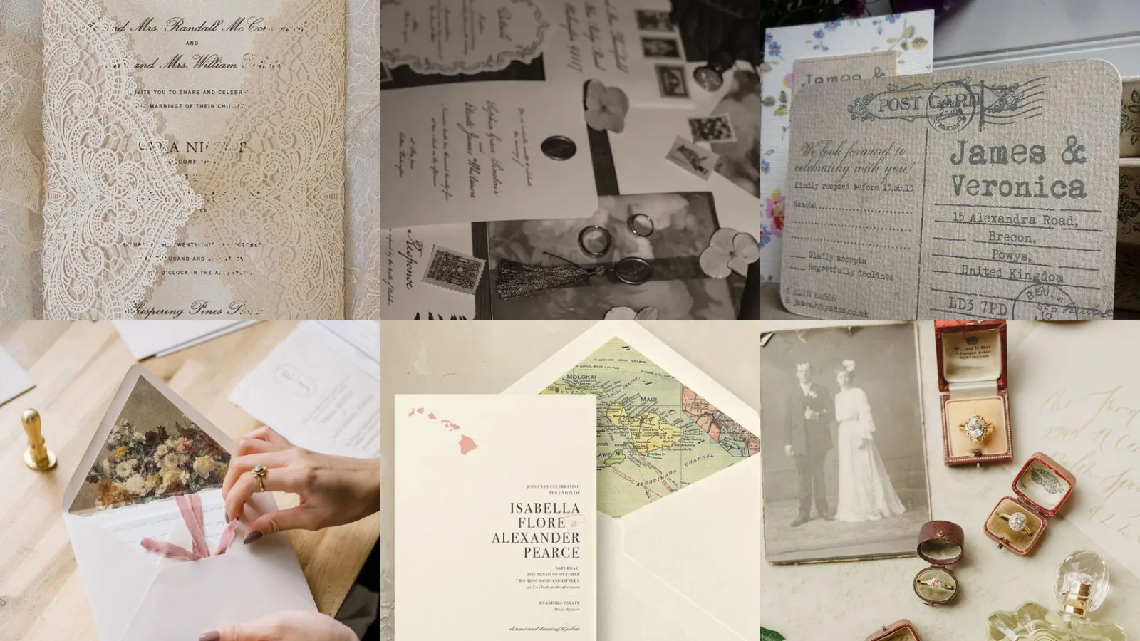
Skip the intro · jump to the list ↓
Wedding season rolls around and everyone suddenly wants their invites to look like they came out of a dusty old attic in the best way possible. The problem is most people go straight to a template site and end up with something that reads more office memo than heirloom. That’s the mistake worth avoiding this year.
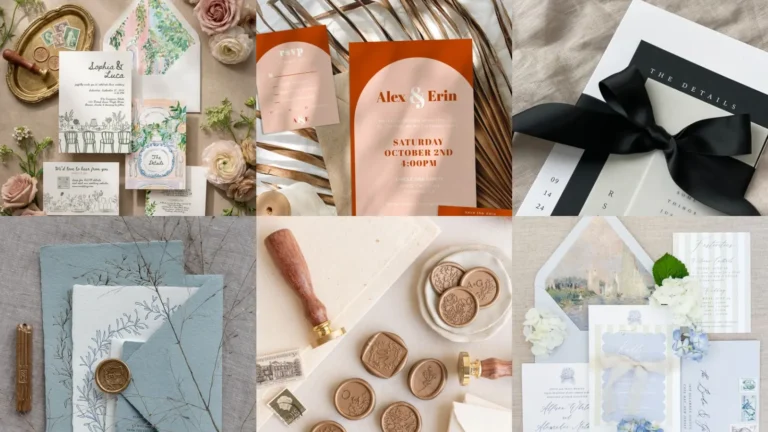
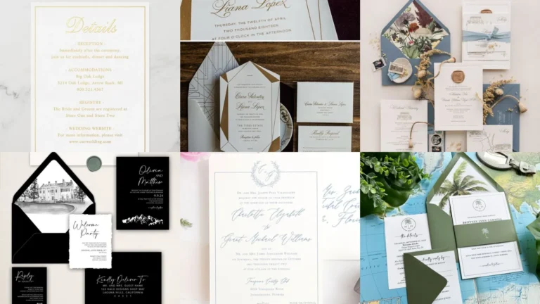
A real vintage invitation suite takes a little more thought than picking a cursive font and calling it done. It’s about paper texture, color, the little seals and ribbons that make someone actually pause before opening it. Below you’ll find 20 ideas that get that balance right.
These were pulled from hundreds of pins, honestly. Most got tossed because they looked so pretty in a photo but would’ve cost a fortune to actually print and mail.
What’s left are the ones that hold up. Some lean rustic, some lean fancy, some are somewhere in between and all of them work for a real budget.
Use this as a scrolling mood board more than a strict rulebook. Mix elements if something catches your eye, nobody’s grading you on historical accuracy, lol!
Each idea below has a little detail explaining what makes it work plus a link if you want the full how-to. Let’s get into it.
VINTAGE INVITATION SUITE IDEAS
Antique Lace Invitation Suite
Lace has that instant grandmother’s-attic feeling, doesn’t it? A thin lace overlay on cardstock does most of the work here without needing much else.
Cream or ivory paper keeps it from looking costumey. This is one of those suites that photographs beautifully on a marble table, plain and simple.
Retro Typewriter Font Invites
Typewriter fonts give off a very specific old letter energy. There’s something about the uneven letter spacing that makes it feel handmade even when it’s printed.
Pair it with a plain kraft envelope and skip anything glossy. Simple, a little quirky and it never looks try-hard.
Victorian Botanical Invitation Set
Victorian botanical prints bring in ferns, roses and little sketched birds along the border. It reads like a page pulled from an old naturalist’s journal.
This one takes a bit more design work than most on this list. Worth it if your venue already leans garden party.
Old World Wax Seal Envelopes
Wax seals used to just mean sealing a letter shut. Now they’re basically jewelry for an envelope. Honestly they earned their spot on every fancy invite this year.
A deep burgundy or gold wax stamped with a simple initial looks properly old world. Fair warning, the wax can crack in cold mail trucks so pack them flat.
Sepia Toned Photo Invitations
Sepia toned photos on an invite reads as flipping through somebody’s old family album. Couples use engagement photos run through a sepia filter for this one all the time.
It works especially well for anniversary parties or vow renewals. There’s a warmth to it that a plain white card just can’t match.
Art Deco Gatsby Inspired Suite
Gatsby style invites go heavy on geometric borders, metallic ink and that unmistakable roaring twenties font. Black, gold and emerald green show up together constantly here.
This is the suite for anyone throwing a party with a full bar and a jazz playlist. Not that I’m judging, I’d show up in a feather headpiece myself, haha!
Dried Flower Pressed Invitations
Pressed flowers glued directly onto the card front give each invite its own tiny imperfection. No two ever look exactly alike, which some people love and some find stressful, lol!
Baby’s breath and pressed pansies hold their shape the longest. Skip anything with thick petals since those tend to mold before the invites even get mailed.
Handwritten Calligraphy Vintage Cards
Real handwritten calligraphy still beats any font you can download. There’s a slight wobble in the ink that machines just can’t fake.
Hire this out if your guest list runs long, your hand will thank you.
Antique Postcard Style Invites
Postcard style invites flip the whole format on its head. The details sit on the back exactly the way an old travel postcard would, stamp graphic included.
It’s playful without losing the vintage feel entirely. Great option for a destination wedding or a casual anniversary bash.
Rustic Kraft Paper Suite
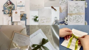
Kraft paper brings the price down and the charm up, which is a rare combination. It pairs beautifully with twine, a wax seal or a pressed sprig of eucalyptus.
This is the one to copy first if you’re working with a tight budget. It still looks intentional, never cheap.
Floral Damask Pattern Invitations
Damask patterns bring that formal, almost wallpaper-in-a-fancy-parlor look. Deep jewel tones with a subtle pattern layered underneath the text keep it from feeling flat.
Ribbon Tied Vintage Envelopes
A simple ribbon tied around the envelope turns an ordinary card into something someone wants to keep. Satin or grosgrain both work, though velvet ribbon looks especially rich for winter weddings.
Skip the bow if your guests are opening a lot of mail that week, a simple knot opens faster.
Ornate Gold Foil Borders
Gold foil borders dress up even the plainest paper stock. It’s the detail that photographs well under any lighting, candlelit reception or bright morning brunch.
A thin foil edge goes a long way. Too much and it starts looking more disco ball than antique, lol!
Victorian Era Script Lettering
Victorian script lettering has that dramatic loopy quality you’d expect on an old love letter. It takes longer to read than a plain font, which somehow makes guests slow down and actually read the details.
This pairs beautifully with cream paper and a dark ink, navy or deep brown especially.
Faded Rose Color Palette
Faded rose tones, think dusty pink meeting a worn out red, give a suite an instantly aged look without any actual aging involved. It’s soft, a little romantic and never too sweet.
This palette works for spring or fall weddings equally well. Surprisingly flexible for something that looks so specific.
Antique Map Travel Theme
An antique map background is perfect for the couple who met traveling or who’s dragging guests somewhere far for the big day. Old world map lines under the text details tie the whole theme together.
Add a little compass icon or a vintage stamp graphic in the corner. Guests notice these small touches more than you’d think.
Timeworn Parchment Paper Look
That timeworn parchment look mimics paper that’s been sitting in a drawer for decades, edges slightly darkened and a subtle texture running through it. It’s one of the easiest effects to fake with the right cardstock.
Pair it with a wax seal and this suite basically writes its own story before anyone reads a word.
Classic Monogram Wax Stamp
A monogram wax stamp personalizes the entire envelope in one small motion. Two initials pressed into wax feels more permanent than any printed detail ever could.
Order the stamp early though, some shops take three weeks to engrave one.
Grandmillennial Chintz Invitation Design
Chintz patterns bring back that busy floral wallpaper energy that’s suddenly everywhere again. Grandmillennial style leans into pattern clashing on purpose, so don’t be shy about layering two florals together.
This one isn’t for the minimalists. That’s exactly the point. Bold, a little fussy and completely charming.
Nostalgic Family Heirloom Details
Last but definitely not least, we have the heirloom route. Scan an old family photo, a grandparent’s handwriting or a pressed flower from a wedding decades back straight onto the card.
It turns a simple invite into something with actual history behind it. Consider this the one worth spending extra time on, the rest of the suite can stay simple around it.
Just a little note - some of the links on here may be affiliate links, which means I might earn a small commission if you decide to shop through them (at no extra cost to you!). I only post content which I'm truly enthusiastic about and would suggest to others.
And as you know, I seriously love seeing your takes on the looks and ideas on here - that means the world to me! If you recreate something, please share it here in the comments or feel free to send me a pic. I'm always excited to meet y'all! ✨🤍
Xoxo Alessandra
✨ Wait! Your next favorite is right here
These are the posts readers open next. See why: